Thursday, 24 January 2013

Final Copies - Front Cover, Contents Page, Double Page Spread
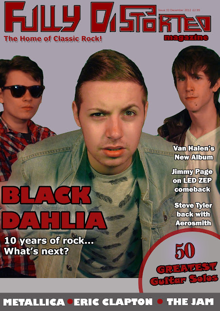
Final edited copy of my FullyDistorted Front Cover:


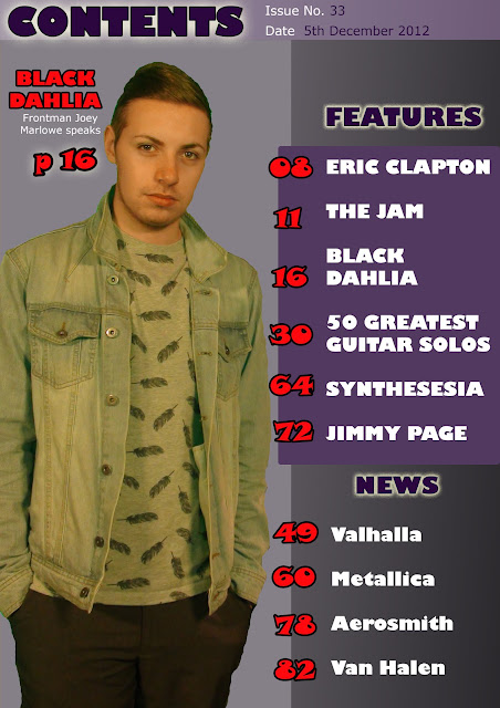
Final edited copy of my FullyDistorted Contents Page:

Final Edited Copy of my FullyDistorted Double Page Spread:

Thursday, 3 January 2013
Audience Test - Double Page Spread
Filmed feedback from an audience viewing the Double Page Spread before amendments:
Audience Test/Feedback - Front Cover/ Contents Page
Filmed feedback from an audience viewing my final copies before amendments:
Tuesday, 11 December 2012
First Copies - Front Cover, Contents Page & Double Page Spread
The edited layout for my FullyDistorted Front Cover:

The edited layout for my FullyDistorted Contents Page:
The edited layout for my FullyDistorted Double-Page Spread:

The edited layout for my FullyDistorted Contents Page:

The edited layout for my FullyDistorted Double-Page Spread:

Original Images
The unedited images originally taken during the photoshoot, which I intend to use in my magazine...
Front cover?

Contents Page

Double Page Spread


Front cover?

Contents Page

Double Page Spread


Thursday, 15 November 2012
Photoshoot Plan
Photoshoot Plan

A plan for the photographs I will take for FullyDistorted Magazine...

Tuesday, 13 November 2012
Production Report (Models/ Equipment/ Props)
Models for FullyDistorted Magazine
- For my Rock Music Magazine, I intend to feature a three-piece rock group as the main feature article, and so therefore they will be featuring on the front cover. The models who I will hire to appear in my photographs as the group will be Callum, Aiden, and myself. To reflect the retro, classic style of the music in my magazine, we will be dressed in a 70s'/80s' fashion and with rock star clothing.
- We will not require makeup as the image for the magazine is not intended to be glamorous or attractive, but the lead singer will be of interest and so will have to come across as impressive to the reader. To convey that the group is successful and performs rock music, one of the models will be holding a prop of an Electric Guitar, however the lead singer will not have any props so as not to take away focus.
- To capture my images I will require a Digital Camera and tripod, in order to make the photographs as professional-lookng as possible and similar in appearance to the images I found in examples of previous magazines. I will take the images of my models so that they are in environmental and fairly empty spaces, such as a field or empty road, so that the group stand out even more. This may be more effectively achieved by capturing the images through a photo shoot and using a green screen, allowing for my images to be professionally edited.
- For my Rock Music Magazine, I intend to feature a three-piece rock group as the main feature article, and so therefore they will be featuring on the front cover. The models who I will hire to appear in my photographs as the group will be Callum, Aiden, and myself. To reflect the retro, classic style of the music in my magazine, we will be dressed in a 70s'/80s' fashion and with rock star clothing.
- We will not require makeup as the image for the magazine is not intended to be glamorous or attractive, but the lead singer will be of interest and so will have to come across as impressive to the reader. To convey that the group is successful and performs rock music, one of the models will be holding a prop of an Electric Guitar, however the lead singer will not have any props so as not to take away focus.
- To capture my images I will require a Digital Camera and tripod, in order to make the photographs as professional-lookng as possible and similar in appearance to the images I found in examples of previous magazines. I will take the images of my models so that they are in environmental and fairly empty spaces, such as a field or empty road, so that the group stand out even more. This may be more effectively achieved by capturing the images through a photo shoot and using a green screen, allowing for my images to be professionally edited.
Saturday, 10 November 2012
Mock Front Cover/ Contents Page Layouts
Some Draft copies of Layout Ideas for FullyDistorted Front Covers/Contents Pages...
Mock Front Cover Draft

Mock Contents Page Draft Ideas

Mock Front Cover Layout

Mock Contents Page Layout

Mock Main Article Layout

Tuesday, 6 November 2012
Draft Article for Rock Music Magazine
Bruised Voodoo: The Next Step Forward?
By Adam Thornton
Twenty-Five years of Britain’s
biggest Rock act, but what is to come?Speaking to the dreadlocked, gruff rock god – frontman for Voodoo since 1989 – it’s impossible to believe that the man himself has been hailed as the biggest icon of the next generation. ‘It comes as part of the job’ he says. But no other group in recent years springs to mind when it comes to Classic Rock, a reputation which has been built up over a quarter of a century; ‘we always wanted to stay fresh and true to our roots, and create the music we loved while growing up. It’s all about taking the stuff of Rock’s past and making it new’.
The group have even coped with
the trauma of losing their original drummer Rickie ‘Blades’ Hammstein in
2007, but nothing will stop them in
their quest to create the perfect hybrid of Classic Rock. Cancelling a batch of
sell-out concerts immediately afterwards, Voodoo vowed to return – and return
they did. In fact, the aftermath of Blades’ tragic death led to some of their
most powerful tunes, plus a tribute to their band mate through their
performance at StageFright twenty years after their first appearance there.
Rock Music Magazine Proposal
Rock Music Magazine Proposal
I intend to produce a new rock music magazine called FullyDistorted, with my design covering a house style that will be present in the front cover right through to double-page spread articles. This house style will remain simplistic and contrasting to catch the reader's eye and reflect the classic style of music they enjoy. The magazine will be aimed at teenagers and young adults aged 16 to 30 who are interested in current and classic rock music. Due to the target audience, the features will primarily be based on artists and the songs that they will be enthusiastic about. However, my articles will also encompass older acts and new stories that will be of interest to the reader as well. This would be covered in the News section of the magazine too. There will be a focus on imagery over text, and by focusing on one main artist my use of photographs will promote their importance on the front cover. Due to the classic style of the genre, I do not intend to use a flashy, colourful house style, and will perhaps concentrate on black and white or individual colours. I will intend to use a variety of images so that there is not one specific style of artist in the magazine - but a clear respresentation of all the important artists at the same time. The magazine will fetch for around two to three pounds, as this is the price range the target audience are most willing to spend for a magazine of their interest. My budget to produce the images and features of my magazine will be £500.
I intend to produce a new rock music magazine called FullyDistorted, with my design covering a house style that will be present in the front cover right through to double-page spread articles. This house style will remain simplistic and contrasting to catch the reader's eye and reflect the classic style of music they enjoy. The magazine will be aimed at teenagers and young adults aged 16 to 30 who are interested in current and classic rock music. Due to the target audience, the features will primarily be based on artists and the songs that they will be enthusiastic about. However, my articles will also encompass older acts and new stories that will be of interest to the reader as well. This would be covered in the News section of the magazine too. There will be a focus on imagery over text, and by focusing on one main artist my use of photographs will promote their importance on the front cover. Due to the classic style of the genre, I do not intend to use a flashy, colourful house style, and will perhaps concentrate on black and white or individual colours. I will intend to use a variety of images so that there is not one specific style of artist in the magazine - but a clear respresentation of all the important artists at the same time. The magazine will fetch for around two to three pounds, as this is the price range the target audience are most willing to spend for a magazine of their interest. My budget to produce the images and features of my magazine will be £500.
Tuesday, 30 October 2012
Initial Ideas for Company Name/Logo/Profile
Initial Thoughts
Ideas for a Rock Music Magazine Company/Name:
Ideas for a Rock Music Magazine Company/Name:
- Should reflect musical style
- One word? short and powerful
- i.e '_________ Magazine'?
- Named after a famous song/album? (e.g Forty Licks, Purple Haze)
- Could be less elegant and to the point instead
- Shaped like a guitar after the mast head
- Possible Hippie-style patterns?
- Contrasting colours?
- Article about an artist going solo
- Latest group success and future work
- Information about an uprising group?
Tuesday, 23 October 2012
Research into Publishers (IPC Media/Future PLC/ Bauer Publishing)
Publishers and Distributors
IPC Media
IPC Media is one of the three largest publishing houses in the UK, being a divison of TimeWarner (which is the corporation owning Warner Bros, for example). IPC covers a range of platforms in the Media, such as online, through print or phones. IPC can be found through over 60 brands, which reach 26 million adults nationwide. IPC's products could be said to engage women generally more than men - with two thirds of adult woman targeted.
The famous brands through IPC range from Sport and Leisure and TV Entertainment to Women's Fashion and Home Interest. IPC is divided into three main publishing areas - IPC Connect, IPC Inspire and IPC Southbank. The first two comprise Women and Men's entertainment respectively (Now, Chat and TvTimes/RugbyWorld, Nuts, NME), whilst the latter is more elegant in style and includes fashion-related products which target a sophisticated female audience. It is clear from these divisions that IPC appeals to a wide range of consumers. Additionally, IPC Advertising is also a division which can promote clients's products who purchase advertising across any of IPC's brands.
In summary, IPC is a broad publisher, which has grown in size since being a publisher for 50 years. Therefore, IPC's success is due to covering both sexes and a range of well-known brands that are recognised across the country.
Future PLC
Future PLC is a publisher which strives to 'be the number one provider of trusted editorial services for enthusiasts in every one of our specialist sectors, and to be the number one partner of the companies who want to do business with these enthusiasts'
Since 1985, Future PLC has grown to cover numerous formats aimed at niche markets of certain interests, for example photography and film or video games. Future PLC has operations in the US, UK and Australiawhich proves its international appeal - using magazines, websites and events to attract audiences to over 200 special interest publications.
Future PLC defines its' products into several sectors - Technology, Entertainment & Video Games, Sport & Auto, Music, and Creative. Main brands that appeal to a generally male target audience include: T3, TotalFilm, Classic Rock, GamesRadar and Official Xbox Magazine. Due to this, FuturePLC is the largest UK magazine exporter and magazine licensor. Although specialising in a more intelligent, specialist range of publications, magazines have exported to 89 other countries as well. Obviously, through the modern target audience, the web has played a large part in building the popularity of the corporation, with over 1.3 million Facebook fans, and FuturePLC now braodening into apps and websites.
Although it covers less wide-ranging products, and focusing on a smaller target audience, through providing a connected, unifying style to all of its publications a large following of people interested in these magazines are more likely to purchase them.
Bauer
Bauer Publishing is the final media company which reaches a wide range of people through publishing 282 magazines. There are numerous genres of brands that Bauer encompasses, having grown in size since 'Bella' magazine in 1987 to now include Women's Weeklies, TV Listings, Puzzles, Lifestyle, Music & Film, and Special Interest publications.
Having been founded in 1875 in Germany, and now comprising products which are sold in 15 countries, Bauer is clearly an example of a publishing house whose appeal mirrors its size. Bauer is successful at drawing in a wide target audience due to exporting to many countries, and constantly acquiring new products (such as Emap's Radio and Consumer Magazine divisions). Bauer has a considerable market share in nationwide magazine sales, as the popularity of the main brands has remained constant.
The range of products through Bauer includes 'Take a Break', 'That's Life!' and 'Spirit and Destiny', as well as puzzle magazines like 'Codebreakers' and 'Take a Puzzle' - so therefore a alrgely female target audience. By specialising in the one sex, Bauer has therefore increased its' popularity rather than generalising the audience to more people (as women are more likely to have time to spend money on magazines), and become one of the largest distributors also.
IPC Media
IPC Media is one of the three largest publishing houses in the UK, being a divison of TimeWarner (which is the corporation owning Warner Bros, for example). IPC covers a range of platforms in the Media, such as online, through print or phones. IPC can be found through over 60 brands, which reach 26 million adults nationwide. IPC's products could be said to engage women generally more than men - with two thirds of adult woman targeted.
The famous brands through IPC range from Sport and Leisure and TV Entertainment to Women's Fashion and Home Interest. IPC is divided into three main publishing areas - IPC Connect, IPC Inspire and IPC Southbank. The first two comprise Women and Men's entertainment respectively (Now, Chat and TvTimes/RugbyWorld, Nuts, NME), whilst the latter is more elegant in style and includes fashion-related products which target a sophisticated female audience. It is clear from these divisions that IPC appeals to a wide range of consumers. Additionally, IPC Advertising is also a division which can promote clients's products who purchase advertising across any of IPC's brands.
In summary, IPC is a broad publisher, which has grown in size since being a publisher for 50 years. Therefore, IPC's success is due to covering both sexes and a range of well-known brands that are recognised across the country.
Future PLC
Future PLC is a publisher which strives to 'be the number one provider of trusted editorial services for enthusiasts in every one of our specialist sectors, and to be the number one partner of the companies who want to do business with these enthusiasts'
Since 1985, Future PLC has grown to cover numerous formats aimed at niche markets of certain interests, for example photography and film or video games. Future PLC has operations in the US, UK and Australiawhich proves its international appeal - using magazines, websites and events to attract audiences to over 200 special interest publications.
Future PLC defines its' products into several sectors - Technology, Entertainment & Video Games, Sport & Auto, Music, and Creative. Main brands that appeal to a generally male target audience include: T3, TotalFilm, Classic Rock, GamesRadar and Official Xbox Magazine. Due to this, FuturePLC is the largest UK magazine exporter and magazine licensor. Although specialising in a more intelligent, specialist range of publications, magazines have exported to 89 other countries as well. Obviously, through the modern target audience, the web has played a large part in building the popularity of the corporation, with over 1.3 million Facebook fans, and FuturePLC now braodening into apps and websites.
Although it covers less wide-ranging products, and focusing on a smaller target audience, through providing a connected, unifying style to all of its publications a large following of people interested in these magazines are more likely to purchase them.
Bauer
Bauer Publishing is the final media company which reaches a wide range of people through publishing 282 magazines. There are numerous genres of brands that Bauer encompasses, having grown in size since 'Bella' magazine in 1987 to now include Women's Weeklies, TV Listings, Puzzles, Lifestyle, Music & Film, and Special Interest publications.
Having been founded in 1875 in Germany, and now comprising products which are sold in 15 countries, Bauer is clearly an example of a publishing house whose appeal mirrors its size. Bauer is successful at drawing in a wide target audience due to exporting to many countries, and constantly acquiring new products (such as Emap's Radio and Consumer Magazine divisions). Bauer has a considerable market share in nationwide magazine sales, as the popularity of the main brands has remained constant.
The range of products through Bauer includes 'Take a Break', 'That's Life!' and 'Spirit and Destiny', as well as puzzle magazines like 'Codebreakers' and 'Take a Puzzle' - so therefore a alrgely female target audience. By specialising in the one sex, Bauer has therefore increased its' popularity rather than generalising the audience to more people (as women are more likely to have time to spend money on magazines), and become one of the largest distributors also.
Mood Board (Colours, Fonts, House Style)
Mood Board
For my rock music magazine, the house style will incorporate black and white for the majority of text, with some areas of red to catch the eye. I will keep a two column style so that entire pages can be taken up by the images I will wish to use.
Possible font styles and colours to imitate:


For my rock music magazine, the house style will incorporate black and white for the majority of text, with some areas of red to catch the eye. I will keep a two column style so that entire pages can be taken up by the images I will wish to use.
Possible font styles and colours to imitate:

Possible magazine layouts and house styles to imitate:

Thursday, 18 October 2012
Analysis of 'Classic Rock'/ 'Q' Contents Pages
Classic Rock Contents Page Analysis

1. The 'Contents' cover line is serif in font style and black in colour. This reflects as stylish, elegant approach to the magazine. Along with a black strip across the top of the page to break up the imagery, this is placed to the top right corner of the page, which the target audience will notice but not immediately over the main image.
2. The main image and cover line take up the left hand side of the contents page. It is arguable that the title 'Rolling Stones' takes preference over the 'Contents' title as it reflects what is most important to the reader. The font style is the same which keeps coordination with the other cover line. The image, meanwhile, takes up the entire page and is a Long Shot of the group. This helps make the main feature of the magazine stand out to the reader. By being in black and white, this again suggests the magazine's features are classic and elegant, which again will interest the target audience.
3. The colours of black and white take up the majority of the house style, however there are small areas of red which reflect areas of the magazine that the reader should remember; for example the page numbers and 'Exclusive Interviews' plug. By standing out against the monochrome, the target audience will notice these areas of text after the main image, and subliminally the magazine is promoted as the reader will want to flick through to the page numbers.
4. The right hand side of the page features the majority of textual information. This creates a two-column layout to the contents page. By being in black, this suggests an informational tone to the text. The list of features are small in size compared to the cover lines. The names of the artists are slightly larger which suggests more importance than that of the description. In this way the reader will spot the artist names and then want to read about the features afterwards. The font style of the contents are serif, which is clear against the white background but is not too eye-catching.
5. In this way, small areas of white text are placed over the main image, providing a caption to it and background information. as this is the last thing the reader should notice, it is placed to the bottom right of the page, and is very small in size. It also juxtaposes the left hand side of the page (white text over the image) with the right hand side (black text over a white background) which is pleasing to the eye and is easy for the reader to differentiate.
Q Contents Page Analysis

1. The cover line for the magazine is placed to the top left hand corner of the page. This is so that the target audience will know what the page includes immediately. Next to the magazine logo, and keeping in with the house style, this will suggest a continuity to the front cover and promote the magazine therefore. The cover line is large in size and a sans serif font which makes it sharp and eye-catching against the black background which stretches across the top of the page.
2. The house style of the magazine is black, white and red, each of the colours having a certain impact on the way the magazine looks. There is also a two-column layout and a smaller box of information which mimics the top of the page, segregating it from the rest of the page. In this way the magazine is presented as being easy to read, and being tabloid-like but current in style. This is complemented by the images which are wrapped around the text. The contents page is imitating the rest of the magazine, and so therefore has to be easy for the target audience to visualise so as not to be put off.
3. The main image is a long shot of a group which the magazine will feature as one of their top stories, due to the interest the target audience will have for them. For this reason the image takes the main focus over the cover lines, and takes up a lot of the page. It is placed to the right hand side of the page to keep in with the house style and columns that the rest of the magazine will follow. A caption giving details about the group is placed over the image, but is lower down and not large enough in size to detract focus, along with being black over white like the left hand side of the page. This makes it easy to read over the image.
4. Keeping the colours coordinated, the left hand side of the page features a list of contents, which incorporate different sized fonts depending on the text. For example, the cover lines of individual stories are in block capitals and a sans serif font, being slightly larger than the accompanying information,. This ensures the reader notices the features first, and then reads on to find out more. This is achieved throught the page numbers being in red, and the information being in a serif font. They will therefore flick to these pages as the contents page is promoting them.
5. Other areas of information, such as common features and reviews which a newcoming reader will not be as aware of, are lower down the left hand side of the page, and also in the smaller box underneath the main image. This prevents the target audience finding the oage to cluttered, and losing focus on the more important features. The font size for the reviews is also smaller, and over a darker background which reflects that the section of text is about a different subject than the features. Black strips and the Q logo keep the areas of the contents page broken up and easy to read.
Analysis of Rock Magazine Front Cover
Analysis of Kerrang! Magazine Cover

1. The Mast Head of the magazine contrasts with the background, being white over black. It stretches across the entire top of the page, but is placed beneath the main image, showing the order of focus. As the magazine is so well known it is therefore acceptable that it cannot be read as the target audience will be aware of the product already and will be attracted mainly by the images of their favourite artists instead.
2. The house style is black, white and yellow, and is coordinated through different areas of the front cover. For example the plugs and promotional offers are in yellow, which catches the eye in a sutble way and makes the reader notice them. The colour red is reserved for the title and several small boxes of text as this would decreases the simplistic colour scheme and take up too much focus in large amounts. As a result the importance of text is conveyed to the target audience, and makes it easy on the eye, allowing them to differentiate the types of information.
3. As the magazine is covering stories about embarassing moments involving artists, the imagery on the front cover includes only the artists who will attract the target audience effectively. The layout of this incorporates a lot of smaller images circling the main image. These are primarily Medium and Close Up shots of the artists, to keep as much focus on them as possible. It also suggests to the reader the range of groups that are featuring in the magazine.
4. Along the top and bottom of the page are strips of colour which stand out to the reader, but are not too close to the main images and therefore does not detract focus. These strips feature plugs, which are in varying colours which keep in with the house style. Therefore, the content of the magazine is promoted subtly, and will be easy for the target audience to differentiate form the other text.
5. The main cover line for the front cover is red in colour, and over a white background over the image. This is placed in the centre of the page which makes it quick to spot. The colour coordinates with the smaller cover lines and plugs along the bottom of the page, which suggests a different style of information to the other aspects of the front cover. The font style is sans serif which is easy on the eye and similar to the rest of the magazine, suggesting a hard edge.
Thursday, 11 October 2012
Codes/ Conventions/ Audience of a Rock Music magazine
Some key codes,conventions and audience expectations found in Rock music magazines:
I have gained this information from my questionnaire and secondary research into the appearance of music magazines.
- Depending on the style of music, the layout and imagery of rock music magazines differs - from dark, gritty sans serif fonts and Medium Shot images (Kerrang, Rock Sound) to a more sophisticated reliance on one image and less bold font choices (Rolling Stone). Usually however, a common link is that the main focus of the page is that of the biggest artist which will interest the target audience - so a new metal group or a successful singer, for example. The images will rarely be profiles or Close up images from a photoshoot, but can opt for a black and white approach depending on the overall style of the issue. The main image reflects the house style of the entire magazine, and so often takes up most of the page and may feature in contents pages as prominently.
- The Mast Heads of rock music magazine have to reflect the image of the entire genre and style of music, so is therefore in a natural colour which contrasts with the background image - rarely yellow or red. The font style is often sans serif and in block capitals, which suggests the current, edgy apearance of rock music. This font style is similar throughout, though in areas of less importance (e.g additional textual information, quotations to support images) the text can be smaller and/or a different style in order to convey a difference in the messages given off by different fonts. In this way, block capitals are normally reserved for big cover lines and artist names.
- Generally the target audience will not be enticed by special offers, features and competitions - rather the stories of their favourite bands or musicians, and their backgrounds. Therefore, the plugs which may feature on the front cover and contents pages will not be large in size, and may reflect the artists themselves. There is more priority for secondary images on front covers, therefore, as this will make the magazine easier on the eye to spot the images before text. It also is used to suggest the variety of artists that the magazine will feature and make the style more aesthetically pleasing. Notably these smaller images - throughout the magazine in some cases - will be wrapped around the main image which gathers most attention, which keeps in with the layout of each magazine.
- Also, the colours throughout the magazine will not differ very much. In the case of titles, cover lines and the main text, this will normally be black or white over a background of the opposite cover (with the title being a lot larger and occaionally a more eye-catching font style too). Depending on the importance of the interview/article, there can be boxes of text to give a summary of the artist or provide the backstory to a picture - which will often keep coordinated with the house style of the magazine. Often, there is a lack of text altogether, as images can take up the majority of the page. This depends again on the style of music and the specific target audience, as a metal music magazine will not require much text to support the images of the vicious new death metal act, whereas Rolling Stone may feature more backstory and information to provide a balance of the visual aspects of the magazine to appear easier on the eye.
- Also, the general features of rock magazines (as mentioned) will be based on upcoming releases, possibly tours and important news for main artists, and interviews. there may be more specific areas such as reviews and in-depth articles on older acts, or on the other hand a broader range of media (for example Rolling Stone) which also covers aspects of the media such as new films and television shows which link to the musical influences and will be of interest to the target audience. It is important that less is often more, and what the magazine will communicate visually through its' style will reflect the features moreso than text or colours. The target audience will be inclined to pick up on these images and visual aspects, so therefore they take priority in most magazines.
I have gained this information from my questionnaire and secondary research into the appearance of music magazines.
- Depending on the style of music, the layout and imagery of rock music magazines differs - from dark, gritty sans serif fonts and Medium Shot images (Kerrang, Rock Sound) to a more sophisticated reliance on one image and less bold font choices (Rolling Stone). Usually however, a common link is that the main focus of the page is that of the biggest artist which will interest the target audience - so a new metal group or a successful singer, for example. The images will rarely be profiles or Close up images from a photoshoot, but can opt for a black and white approach depending on the overall style of the issue. The main image reflects the house style of the entire magazine, and so often takes up most of the page and may feature in contents pages as prominently.
- The Mast Heads of rock music magazine have to reflect the image of the entire genre and style of music, so is therefore in a natural colour which contrasts with the background image - rarely yellow or red. The font style is often sans serif and in block capitals, which suggests the current, edgy apearance of rock music. This font style is similar throughout, though in areas of less importance (e.g additional textual information, quotations to support images) the text can be smaller and/or a different style in order to convey a difference in the messages given off by different fonts. In this way, block capitals are normally reserved for big cover lines and artist names.
- Generally the target audience will not be enticed by special offers, features and competitions - rather the stories of their favourite bands or musicians, and their backgrounds. Therefore, the plugs which may feature on the front cover and contents pages will not be large in size, and may reflect the artists themselves. There is more priority for secondary images on front covers, therefore, as this will make the magazine easier on the eye to spot the images before text. It also is used to suggest the variety of artists that the magazine will feature and make the style more aesthetically pleasing. Notably these smaller images - throughout the magazine in some cases - will be wrapped around the main image which gathers most attention, which keeps in with the layout of each magazine.
- Also, the colours throughout the magazine will not differ very much. In the case of titles, cover lines and the main text, this will normally be black or white over a background of the opposite cover (with the title being a lot larger and occaionally a more eye-catching font style too). Depending on the importance of the interview/article, there can be boxes of text to give a summary of the artist or provide the backstory to a picture - which will often keep coordinated with the house style of the magazine. Often, there is a lack of text altogether, as images can take up the majority of the page. This depends again on the style of music and the specific target audience, as a metal music magazine will not require much text to support the images of the vicious new death metal act, whereas Rolling Stone may feature more backstory and information to provide a balance of the visual aspects of the magazine to appear easier on the eye.
- Also, the general features of rock magazines (as mentioned) will be based on upcoming releases, possibly tours and important news for main artists, and interviews. there may be more specific areas such as reviews and in-depth articles on older acts, or on the other hand a broader range of media (for example Rolling Stone) which also covers aspects of the media such as new films and television shows which link to the musical influences and will be of interest to the target audience. It is important that less is often more, and what the magazine will communicate visually through its' style will reflect the features moreso than text or colours. The target audience will be inclined to pick up on these images and visual aspects, so therefore they take priority in most magazines.
Tuesday, 9 October 2012
Rock Music Primary Research - Questionnaire and Results
Rock Music Magazine Questionnaire
1. Do you listen to rock music? Y/N
2. Do you buy rock music magazines? If so, how much are you willing to spend?
Y/n £________________
3. If so, how often do you buy rock music magazines?
Monthly Weekly Daily
4. What artists in this genre do you listen to? (please list)
________________________________________________________________________
5. Do you often see these artists in rock music magazines? If so, which ones?
________________________________________________________________________
6. Which of these artists would you like to see in a rock music magazine? Why?
_________________________________________________________________________
7. Which of the following do you expect to see in a rock music magazine? (circle)
- Competitions
- Interviews
- News
- Reviews
- Quizzes
- New Artists Articles
8. What sort of article on your favourite artist would you like to see?
______________________________________________________________
9. Are there any other suggestions you would like to make about contents/ imagery of a rock music magazine?
__________________________________________________________________________
Data from results:


From this Primary research it is evident that the majority of fans of Rock music will be willing to spend a good amount on these magazines, as it is expected they will be published monthly. Therefore the quality and house style of my articles must be of a high standard to meet the audience's expectations.
Other feedback from my questionnaire revealed that it will be more effective to feature a lot of images which take preference over the text, as this is what the target audience will prefer. Also, they feel that my articles should feature life backgrounds and musical inspiration for the artists that will appear, as this will keep them interested.
Friday, 5 October 2012
Initial Ideas for Rock Music Magazine
My initial ideas for the music magazine front cover:
- One main image (a new upcoming artist?)
- A new group?
- An artist going solo?
- Image should take up most of the page
- Mast Head should have less preference than the image, but still large
- Maximum of three other stories (as plugs)
- Secondary images around the main one?
- Cover line not in striking colours
- Montage of images on one side
- OR image of the main artist with a strapline (annotating image)
- Contents plugs should take up half the page (other side to images)
- Cover line for main image too?
- Logo in the top corner of page, reflecting house style
- A separate list of specific features (e.g news, reviews)
- One or two main images
- One image should take up almost a full page?
- Cover line not too contrasting with images
- Few boxes of text over the images
- Quotations in large text?
- Smiilar style of fonts for all text, so easy to read (house style)
- Maximum of three columns of writing
Genre/Target Audience Ideas
Genre/Target Audience for my magazine
I intend to produce a new rock music magazine, focusing on the front cover, contents page and a double page spread which will be the main focus of that issue. The magazine will be aimed at teenagers and young adults - the appropriate age group being 14 - 20 year olds - who are interested in current and classic rock music. Due to the target audience, the features will primarily be based on new artists and singles that they will be enthusiastic about. I may also promote other areas that will reflect the target audience's interests - such as news and events or new albums, for example. There wil be a focus on imagery and the presence of the main star through the front cover photograph, most likely. Due to the classic style of the genre, I do not intend to use a flashy, colourful house style, and will perhaps concentrate on black and white so as not to distract the target audience. I will intend to use a variety of images so that there is not one specific style of artist in the magazine, so incorporating medium shot photographs and some more specific images as well.
I intend to produce a new rock music magazine, focusing on the front cover, contents page and a double page spread which will be the main focus of that issue. The magazine will be aimed at teenagers and young adults - the appropriate age group being 14 - 20 year olds - who are interested in current and classic rock music. Due to the target audience, the features will primarily be based on new artists and singles that they will be enthusiastic about. I may also promote other areas that will reflect the target audience's interests - such as news and events or new albums, for example. There wil be a focus on imagery and the presence of the main star through the front cover photograph, most likely. Due to the classic style of the genre, I do not intend to use a flashy, colourful house style, and will perhaps concentrate on black and white so as not to distract the target audience. I will intend to use a variety of images so that there is not one specific style of artist in the magazine, so incorporating medium shot photographs and some more specific images as well.
Subscribe to:
Posts (Atom)